I know that somewhere in the human rubber stamping rule book it says that you've got to have a border on everything. It also says that cards look better in real life (IRL). And it probably says that you should put glossy paper & watercolor paper on the same card.
Honestly, some cards look better on your screen & some look better in real life. Oh human! ALL of them FEEL better in real life!
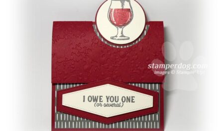
This card looked a bit too dark with a border, but it looks fine when I hold it in my paw! We may just tweak it a little more before my stampers make it on Saturday. What would YOU suggest? (The later improved picture based on your suggestions is at the bottom of this post.)
Ann stamped the Bella Toile stamp in VersaMark ink onto our Stampin' Up! Glossy card stock. Then she brayered the So Saffron ink over it. It's a type of resist.
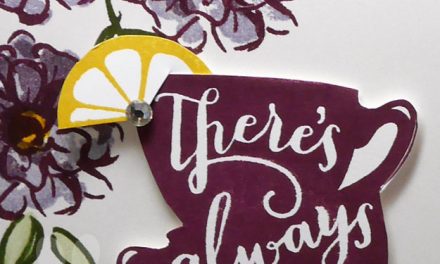
The flowers & greeting are from On the Grow from the Stampin' Up! Summer Mini. It's not going to be in the new catalog so you should get it now if you like it! The Watercolor Paper just sold out so don't let that happen to you for things that you want. when they say "While Supplies Last", they mean it!
Remember, we've got free instructions & such that can be yours when you shop in our online store. You can find out more about that in this post. I'm off to hide just in case the stamp police come by.
Check my Facebook page to see what I came up with later today! You can LIKE ME HERE.
It's a grrrrreat time to be the blog dog of a Stampin' Up! Demonstrator.
– by phone – 530-674-5090
– - by fax – 530-751-7680
– – – by email or even in person!


The thing I love best about scrapbooking and card making is that there are no rules (and any that there are are just there to be broken!) 😀
Your card is gorgeous! I love the simplicity of the sweet little vase of flowers. The little touches of brown give it a lovely sophisticated touch.
Thank you for sharing! 🙂
I love the card & especially love how you made your own background paper; very clever indeed. Great job!
Hi Stamper, I think you should leave this beautiful card just the way it is!
The first thing I noticed was that lively jar of flowers -just what you want I think!
Cynthia from Canada
I’d like to see either the lace ribbon or the lace border punched paper to break up the dark ribbon directly on the DSP.
this is a beautiful card-rules are made to be broken right!!
This is so pretty! I think if I were to CASE it I would reduce the width of the ribbon a tad, and increase the weight of the focal image by either enlarging it or mounting it off center on another circle…perhaps a scallop one. 🙂
Still, it’s a really beautiful card and I love it. Good job!
Elin K.