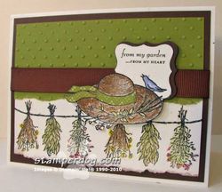
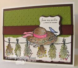
There's major controversy at the Clemmer household. Ann just doesn't know what to do. She asked Cecil which card he liked better. She doesn't have full confidence in his judgement of the arts. (Don't tell the guy I like the most I said that.)
The Garden from the Heart set Ann used is featured in the Stampin' Up! Occasions Mini Catalog. So…which one do you prefer? The OLD OLIVE hat ribbon or the REGAL ROSE hat ribbon. Everything else is the same.
To give them the most objective look, hold your paw up in front of the screen to hide the right card. Then hold your paw up over the left card. OR click on them each to look at close up. Then scroll down & make a comment.
Purchase supplies for your project here.
- Garden from the Heart Stamp Set (Wood #117004 – Cling #118568)
- Watercolor Wonder Crayons
- Aqua Painters (2) #103954
- Confetti White Cardstock #102028
- Polka Dot Textured Impressions Folder #117335
- Chocolate Chip Wide Grosgrain Ribbon #109051
- Tearing Edge #102930
The groundhogs want to know! Happy Groundhog's Day!


I like the one with the pink ribbon. It is more elegantand I’m partial to pink.
I like them both, lotta help I am. There is pink in the herbs so you have some other colors besides green on the card with the green bow.
I would like to know how you did the pattern on the green ribbon!
Thanks, I enjoy “visiting” with you each day and for the tips and encouragement!
Rose Red is the way to go…I like it.
I think that they are both great, but I also am going to be “odd” and say that I like the detail on the olive hatband. Now, if you had the pink with a design on it, I would love that.
Sorry to be the odd one, but I prefer the green ribbon… partly because the green ribbon has a design on it.
However, I agree that the pink gives it more pop.
I like the rose red card. Can’t really say why, just do.
my mom has decorated our entire house with olive green-which i love also. but The different accent colors in each room really pop out and compliment the olive. So i will have to go with the rose red card it makes the card pop.
doodles, design engineer for my mom
I like the pink as it pops it out…. I wonder what a yellow would do on it, just thinking…
Rose Red….too much green on the other card.
Both are lovely but I like the Rose Red as it makes the card “pop.”
I like the one with the Rose Red hat band. As the others have said, it does give a great “pop” of color.
I like the little pop of color on the card on the right with the red ribbon on the hat.
Love your bolg!
Wow. That one little detail changes the mood of the card. The olive hat band makes it look elegant and subdued, and the rose band brings a touch of whimsey. Since it is the dead of winter here, I’ll take the touch of whimsey.
Very nice card either way.